When Adobe came to town recently to host a creative jam, I was asked to give a presentation. If you haven’t been to one of their Creative Jams before, a group of designers come together to create some sort of project (based on the event theme) in just 3 hours. They present their projects to a panel of judges, and a winner is selected. Before the presentations, 3 of us gave talks related in some way to our personal creative processes.
This particular Creative Jam was focused on UI/UX design. As a developer first, designer second, I have spent a lot of time collaborating between design and engineering teams on UI design, and UX-related issues. With that in mind, I thought it made the most sense to give a presentation about that collaboration, and a developer's perspective on how things might be improved for everyone (final product included). It's pretty focused on a designer audience, but I think the insights can be valuable for anyone. In the future, I might write one that's more targeted towards developers.
My full deck is up here, but the rest of this article is based on that talk and you can find most of the slides interspersed with the content below.
The Actual Presentation
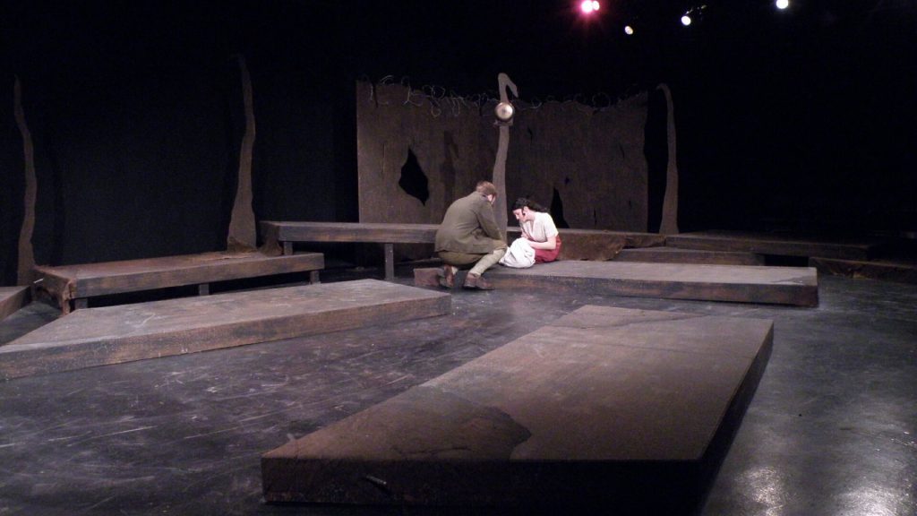
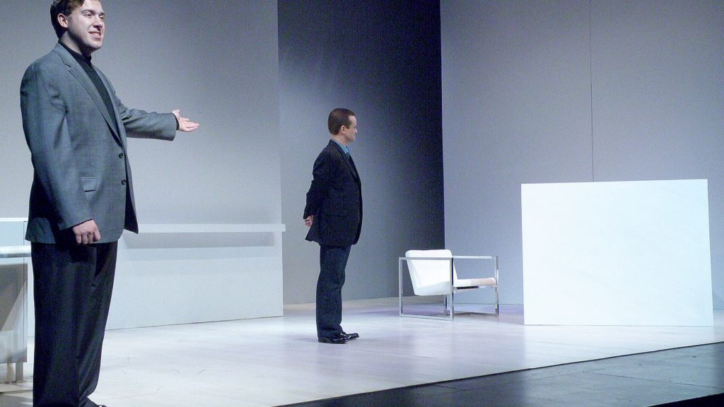
Hey everyone! I’m Heather Weaver. I’m a developer, but I don’t have a computer science degree. I actually studied theatre. Specifically, I studied set design, where I had the opportunity to make not just one ...
but two ...
monochromatic sets. That also meant I spent the bulk of my senior year taking art and design classes, which was pretty cool. After I graduated, I moved out west to LA.
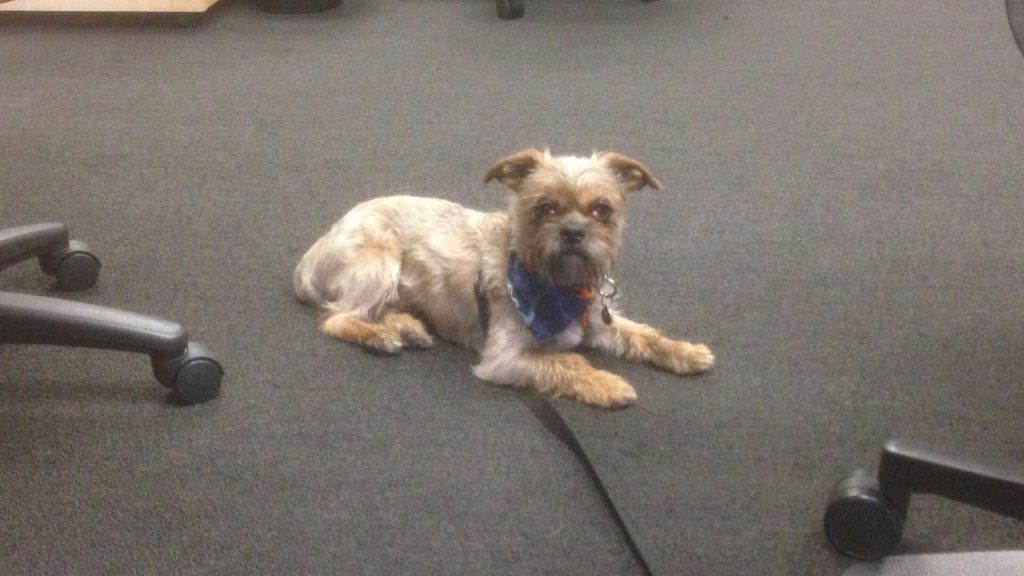
I got a dog,
ate lots of avocados, and did all the things you’re supposed to do when you live in LA.
The plan was to work my way up to being a big art director. As it turns out I hate being on a film set.
Faced with this realization, I started looking for new ways to make money. I taught LEGO robotics and computer classes to elementary schoolers, and found my way into some SEO copywriting work.
Eventually it dawned on me that I should probably get into web development. I’ve always dabbled a bit - my 7th grade typing teacher taught us to make websites out of tables. I also spent a lot of time customizing Myspace profiles for all my friends and their bands. I’d even put together a few long since deleted WordPress sites. The internet has a lot to offer when it comes to learning, so over the course of 6 months I taught myself modern web development. I’ve been doing it ever since.
Sometimes, I don’t feel that legit, because I don’t have a computer science degree. On the other hand, my design background has given me a strong advantage for collaboration.
Why should designers and developers collaborate?
It’s hard to collaborate with every department you should, especially when it hasn’t been done before. Everyone has to buy in, new processes have to be developed … and let’s not forget about coordinating all those schedules. With all the effort you have to put in, is the payoff really worth it? In my experience, the answer is a resounding yes.
1. Determining Project Feasibility
My first “real” job as a coder was at a little software startup back in LA. I worked in the marketing department, for a guy we’ll call Joe. For weeks, I kept overhearing Joe talking about a microsite he was dreaming up. I saw him meeting with a designer, I saw him with the writer, but no matter how I asked I couldn’t get him to show me. He always said he didn’t want to bother me yet, since I was in the middle of a different project.
Some time passes, the other project launches, and we finally sit down … only for me to immediately point out that a major bit of functionality he was relying on would involve an engineering team update to the API. That takes at least a month.
We worked together and came up with a different plan, but it required a few weeks to rethink the design (which had taken a few weeks already) and really dragged the whole thing out. We did collaborate from the beginning after that though. That’s also when I started contributing to the wire-framing and conception phases of projects. I don’t have hard numbers on the time we saved changing our process, but it paid off for many of Joe’s ideas.
2. Push the Design
Developers can do more than just point out problems. Sometimes things that seem really hard are actually quite simple! Such is the way of code. Working closely with a developer allows them to stop options from being ruled out unnecessarily. This can provide many new design possibilities.
One of the things I love about development is how much things change and grow. It’s my responsibility to keep up with exciting improvements, like CSS Grid, and help make the creative team aware of them. Sending articles about the new features is great (and I do), but participating in the creative process and pointing out specific ways to use them works best. Especially for non-coding designers, working with a developer is a boon for exciting layouts, animations, and a lot more.
3. Creative UX Solutions
Inevitably, problems will come up in some project being worked on. Whether it’s due to internal feedback, user testing results, or that guy who won’t stop posting on your Facebook page about how much he hates the settings screen, these problems tend to best be solved with something quick and easy.
A misunderstanding about how something is built makes complexity easy to introduce when brainstorming. Developers, familiar with the existing code, may have ideas for easy-to-implement solutions which effectively solve the problem. If you don’t ask, you’ll never find out! Make sure everyone is aware of feedback to get many more unique solutions.
4. Better Buy-In and Decision Making
No matter how many artboards and hover states and detailed notes are included in the design files, there are going to be decisions that must be made during development. If it’s major, I try to throw it back to the designer. But usually it’s a time crunch at the end, and I just have to decide. When I haven’t been involved up to that point, something I find often with some of my freelance clients, the decisions are hard. I do my best with the designs I’ve been given, but when I’m not familiar with the goals and intent of the design, it’s a struggle. It ends up often dragging out, with someone acting as a go-between. Not the best way to get results.
On the other hand, when I’ve been on the project the whole time, these decisions are an order of magnitude easier. Being in the room for brainstorming, strategy, wireframes, UI design work … it really helps me have a full framework to make decisions in. If I understand the goals of the project, and why certain decisions were made that way, I can continue that approach. I find projects where I’m intimately involved are more cohesive, usable, and faster to develop.
Some Concrete Steps to Better Collaboration
Between my full-time jobs and several years of freelancing, I’ve had the opportunity to work with a variety of teams taking wildly different approaches. I’ve built entire websites without ever speaking directly to the designer - those really tend to drag out. I’ve also found myself at the opposite end of things, involved enough that I got to make the wireframes. Those projects are some of the best.
I’m going to speak in generalities a bit, but through all of these projects I’ve found some good ways to boost developer engagement, and improve the collaboration process.
Collaborate from Beginning to End
I find collaboration is the most effective when developers are involved in all steps, beyond just the design presentation & feedback. This starts with research and strategy. It’s all about the balance, of course, but having an hours worth of background about the project, goals, audience, and so on gives a good structure to work with. The point here is to make sure everyone is coming from the same place.
Personally, I find that having this context enables me to be a lot more proactive. I can come to the table with ideas and solutions, rather than just shooting down features due to technical issues.
On a recent project, a client needed to develop an commerce flow for a product launch. They were working with a new designer on this project. By working closely together from project briefing to the end, we were able to brainstorm a good flow, reuse some existing components, and my knowledge of their site came in handy throughout.
Collaboration should also happen until the end. Just because design files have been handed off doesn’t mean the creative process is over. Designers should make sure to check in every once in a while to give feedback, help with things like animation, and catch little problems before they get too big.
2. Send Review Items Before Meetings
This one is pretty straight-forward. While it’s not always the case, developers tend to be introverted, and might not have as much experience giving on the spot creative feedback. To boost engagement, I find it really helpful to send items for review at least an hour or two before the meeting.
As often the only the developer on the team, it’s tough to give feedback right away. It’s my responsibility to consider feasibility first and foremost, and it’s frankly quite easy to get hung up on the technical details. I often find myself saying no to something that I think of a way to build a couple hours later.
If I’m lucky enough to have designs to review in advance, I find I come to the table with ideas and solutions, rather than just no’s, and I can focus more on the big picture experience. This is a little change that at least anecdotally has big results for diversifying creative involvement.
3. Be User Focused
Think of the user! This is something we all probably know we should be doing. But taking care to be consciously, verbally, user-focused brings everyone back to the same place, which is key. It’s easy to get lost in the things that matter to the work we do, be it using the latest javascript framework or designing a really minimal UI.
I am certainly guilty of this myself. I’ve been in heated arguments about whether it’s more important to write fast code or to have the perfect font weight available for the new design. In that moment, reframing the argument based on the needs of the user would have solved the problem for everyone. We could have asked ourselves, is it more important for the site to load quickly, or will emphasizing this button have enough improvement on the user experience to make the increased load time worthwhile?
By keeping the user at the forefront, everyone stays focused on what matters. Decisions can be reconsidered within the framework of the user, and discussions are more productive. At the end of the day, if it’s better for the user, then that’s the way to go. This helps solve a lot of issues, and unifies the team behind a common goal.
4. Use Tools so Tools Don’t Get in the Way
No one likes that frustration at the end of a project when the build just doesn’t match your designs. It’s frustrating, and when you’re busy fussing over font sizes, you lose track of the important stuff — like the user. Some of this is inevitable - fonts render differently in the browser, or compatibility is a concern.
But honestly - it’s easy to miss stuff! I have five different design programs that I work with regularly based on different client and designer preferences. When I’m trying to also keep up with all the changes in development land, mastery of all the tools is a no go.
I recently started using a tool called Zeplin.
Simply upload design files, and it provides easy access to a lot of relevant UI details, like font styles, asset management, and spacing measurements. This isn’t an endorsement for Zeplin, per say, but more an encouragement to find ways to minimize tool-related confusion. It frees the team up to focus on the big stuff, like the user, and push out the best final product.
5. Systems, Processes, & Style Guides
Consistency minimizes confusion, so figuring out ways to make designs and the final product more consistent is crucial. Things like spacing, margins, font styles, padding, and naming conventions should all be considered.
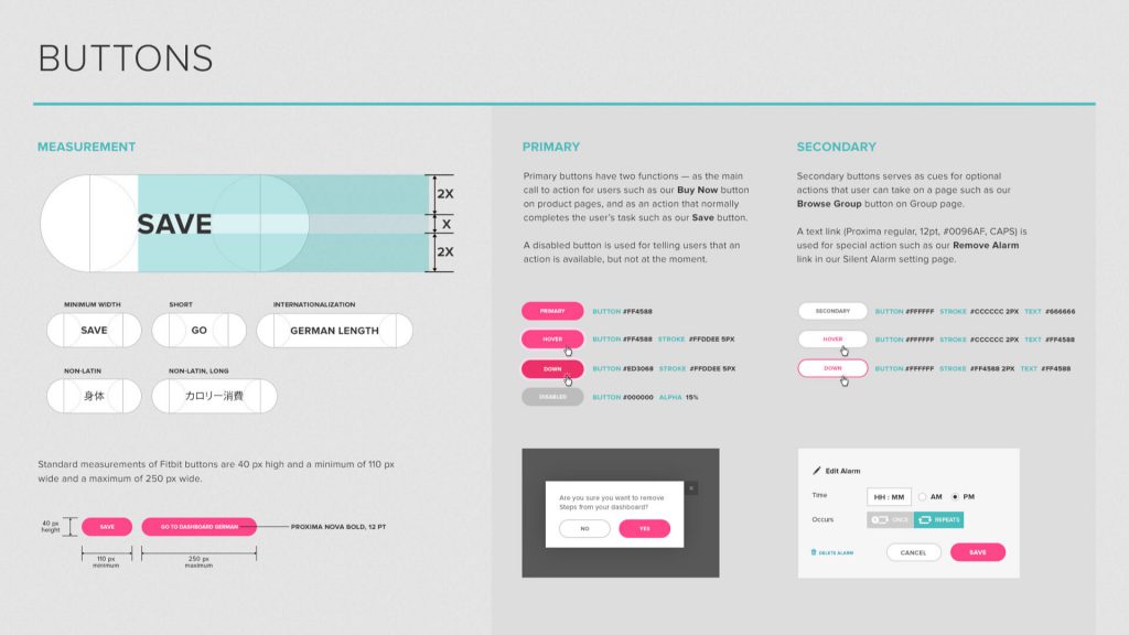
There are a lot of ways that this problem of consistency could be approached. Personally, I think the most straight-forward is to create a style guide which covers all of the basics, like typography, color palette, and general layout guidelines. A style guide allows me to autonomously mitigate consistency across design files. When buttons are two different sizes in two different files, I can reference the style guide for a consistent implementation.
The style guide doesn't have to be as detailed as the one above, but the more details the better. It helps the development team to write more optimized code, minimizes both design and development time, and definitely improves the end user experience by introducing methods for consistency.
6. Do Feedback Better
When it comes to feedback, I have two bits of advice. First, give feedback early and give feedback often.
Early feedback is always better, even when it seems harder. This applies to everyone. Developers should see the designs as early as possible, to point out issues which might cause problems in development. When these issues are caught early, when designs are still being roughed out, they can be fixed in much less time, versus when hours have been spent rendering a gorgeous mockup. Continue to present changes and new pages to developers regularly in case new issues arise.
The same goes for when the project reaches the development stage - giving feedback after a couple pages, or screens, have been built is ideal. Issues can be addressed before they start to compound throughout the site, and if changes are going to be made from the provided designs, better to do so as early as possible. Again, continue to review regularly and keep the feedback loop rolling.
Second, give feedback in context.
There are lots of ways to communicate text-based feedback, but that can get tedious and frustrating. Text is not the most efficient way to exchange feedback, but it’s what we naturally gravitate to. I’ll encourage providing background with any feedback given at any point. Screenshots are great - annotated screenshots are even better! Make it quick and easy for the recipient of any feedback to understand exactly what it is that is being said.
As a side note - when reporting a bug, or a weird issue, steps to replicate it are most helpful! I genuinely want to fix the problems that are brought to my attention, but when I can’t figure out how to make it happen in the first place, I can’t fix it.
7. Get Everyone Drawing
If you want to really draw out an array of unique ideas and solutions, try some group wireframes. Give everyone (or a rep from each department) an opportunity to make a wireframe, and then share at another meeting. Designers can still play the expert, pointing out usability issues and producing the final wireframes, but this is a great way to generate unique ideas.
Communicating solutions can be a lot easier with visual tools. I’d encourage low fidelity here - no need for anyone to get nervous about what tools they do or don’t use. The point is just to get everyone to open up.
Wrapping Up
At the end of the day, not every developer is going to be all about wireframes and user research. However, I believe that with a bit of time and effort, collaboration can happen for any team, product, or project. Working together is going to make you more powerful and productive. Don’t be afraid to ask for advice, or help solving problems. Different perspectives bring new solutions, and the user is going to be better for it.
I'd love to hear about your experience collaborating on UI & UX. Do you? How has it worked? Any tips and tricks of your own? Share a note in the comments below.
